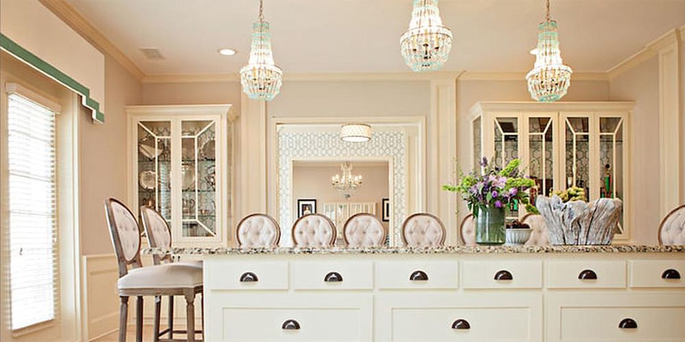
With hundreds of shades to choose from, go straight to the best. These tried-and-true paint colours work for the pros, so they’re sure to hit the right note in your home too.
From: Harper’s BAZAAR US
Related articles:
Haute Blooms: Charlotte Puxley’s Floral Take On Fall/Winter 2016
These Are The Colours Everyone Will Be Talking About In 2017
https://www.harpersbazaar.com.sg/gallery/10-interior-paint-colours/
The 10 Paint Colours Designers Always Use
REVERE PEWTER, BENJAMIN MOORE
image
The 10 Paint Colours Designers Always Use
"This is my go-to colour when working with an open floor plan," says Abbe Fenimore, founder/principal designer at Studio Ten 25. "A fail-safe neutral, it works with all styles, from traditional to modern, and both warm and cool colour palettes. It's a great alternative to white, as it adds enough colour to a room without overwhelming."
GARDEN STONE, CLARK+KENSINGTON
image
The 10 Paint Colours Designers Always Use
"I try to stay away from colours with heavy blue undertones, and I direct my clients toward warm grays that will stand the test of time," say Ace design expert Katie Reynolds. "This shade is a favourite."
DECORATOR'S WHITE, BENJAMIN MOORE
image
The 10 Paint Colours Designers Always Use
"This shade has the most brilliant pure white undertones," says Brittany Zachos of Zachos Design Group. "It's perfect for bright ceilings, trim and even bathrooms when you want a crisp, clean feel."
ESSENTIAL GRAY, SHERWIN WILLIAMS
image
The 10 Paint Colours Designers Always Use
"This colour provides a clean, sophisticated backdrop," says interior designer Kerrie Kelly. "But also adds a nice warmth when paired with white trim."
INTENSE WHITE, BENJAMIN MOORE
image
The 10 Paint Colours Designers Always Use
"Don't be fooled by its name — this colour gives off a grayish tone." says Irene Lovett, founder of designstiles. "It's an ideal backdrop for those who aren't brave enough to go with a bold colour, but still wish for a subtle contrast with white trim. I love pairing this modern hue with transitional furnishings for a more contemporary mix."
WOOL SKEIN, SHERWIN WILLIAMS
image
The 10 Paint Colours Designers Always Use
"If you're looking for a great neutral that will play with the other colours you want to bring into your space, try this one," says interior designer Arianne Bellizaire. "I love this colour because it won't turn 'pink' on you."
SPROUT .06, COLORHOUSE PAINT
image
The 10 Paint Colours Designers Always Use
"I always return to this colour for ceilings," says interior designer Chloe Warner. "It isn't so pink that it stands out, but it reflects flatteringly on everyone in the room."
PALLADIAN BLUE, BENJAMIN MOORE
image
The 10 Paint Colours Designers Always Use
"My go-to paint colours are classic and easy to live with," says interior designer Lauri Ward. "This blue-gray-green shade can be used in almost any room. It's an especially good choice for cooling a very sunny room, or creating a tranquil bedroom."
COMPATIBLE CREAM, SHERWIN WILLIAMS
image
The 10 Paint Colours Designers Always Use
"When I need a yellow that isn't too sunny, I choose this one," says Jill Hosking-Cartland of Hosking Interiors. "This creamy shade is warm, inviting and very flexible when it comes to coordinating with colours with adjoining rooms."
MANCHESTER TAN, BENJAMIN MOORE
image
The 10 Paint Colours Designers Always Use
"This shade is my go-to warm neutral," says Elissa Morgante, co-principal of Morgante-Wilson Architects. "What I love about Manchester Tan is that it changes with the light. It goes from a rich warm hue to light and fresh depending on the source of the light in the room."