
Artist Rajul Shah On Healing Herself And Others Through Art
The artist, who uses the Japanese art of Kintsugi and chakra symbolism in her art, wants you to find your story in her work.
By Nicole Ng - published
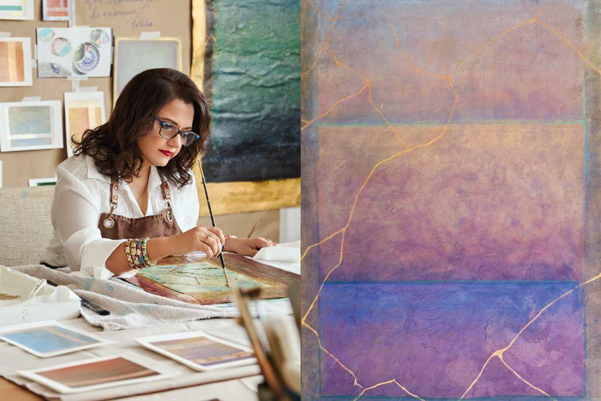
In contemporary abstract artist Rajul Shah’s world, every colour has its own meaning. Red, the colour of the root chakra—the first energy centre in the body, according to various spiritual practices—is stabilising. Purple symbolises the crown chakra and enlightenment, and serene blue hues represent the throat chakra and self-expression. Sheer washes of colour are layered over one another in various shapes, and linked together by a web of vein-like metallic lines inspired by the Japanese art of Kintsugi. Fused together, they come to life as artwork that are a catalyst for healing and hope—not just for her viewers but also herself.

Rajul Shah in her studio.
Evidently, vulnerability and healing are a recipe for success. Today, the Singapore-based artist shows her work at galleries across Mumbai, Paris, Singapore, Tokyo and the United States and has received numerous accolades, the most recent being an honourable mention in the abstract and experimental category in Artists Magazine’s 42nd annual art competition.
Related article: Local Artist Jahan Loh On His Creative Process, Inspirations, Collaborations And More
The abstract painter Mark Rothko is one of your main sources of inspiration. What kind of influence does he have on your work?
When I was researching his use of colour and composition, I found that he visually communicates feelings through art, and rather than have a specific objective with what he wants his viewers to see, it’s all about tonality and colour. I try to build on this aspect of his work, and he inspired me to leverage colour to conceptualise Eastern traditions like chakra symbolism. Geometric shapes help the audience approach my work because they are something familiar to them, and when they come closer, they’re able to look at the layers of texture and get lost in the painting.
These are interrupted by the Kintsugi lines—the golden ‘seams’—which are really a metaphor for life being interrupted by a challenge. Life is interrupted by adversity, it’s not planned. The whole philosophy of Kintsugi is how one deals with that challenge. Applying Kintsugi to the meaning behind the chakra colours in my work creates even more significance.
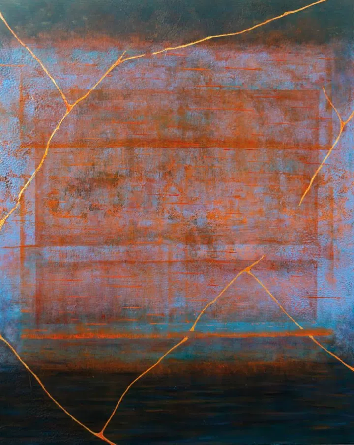
A painting titled Essence.
Why is Kintsugi such a significant practice to you?
I was researching art in Japan and I came across the art of Kintsugi. When a piece of pottery breaks, the Japanese don’t throw it out—they put it back together with gold splicing and tree sap. They want to celebrate the way that pottery has served them. Accepting imperfections and allowing your scars to make you stronger gives you a foundation upon which to launch the next stage of your life. I use the art of Kintsugi, along with chakra symbolism, to remind ourselves that the balance of energy in your body is the most important. Accept the grief that comes with adversity, embrace the scars and let them make you stronger. Kintsugi is metal, and there’s a delicateness to it, but there’s also a metallic strength to it that bonds pieces together, and it’s the same translation to the human experience.
How do you choose the colours for each artwork?
I was doing research on different artists and there’s something called psychic automatism, which artists like Yayoi Kusama, Jackson Pollock and many others have used. It allows your unconscious state to dictate what you lay onto the canvas. I allow my unconscious mind to guide the marks, shapes or colours that I use in each layer, and the layers themselves represent emotions like disbelief, and your reaction to whatever difficulty you’ve experienced.
What do you want viewers to feel when they see your work?
One of the reasons I delved into abstractism is because I wanted the viewer to see their own story in my work. I don’t want to dictate what the story is when I paint. You could say that my objective is for people to find their story in my work, to meditate on the obstacles that they’ve come across and to process that in terms of how they view the colour.

Rooted is inspired by the colour associated with the root chakra.
Related article: Chinese Zodiac 2026 Predictions: What Will The Year Of The Fire Horse Bring?
As someone who heavily uses vibrant colours in their work, what are your thoughts on Pantone’s colour of 2026 being Cloud Dancer?
I love Pantone and how they they continually evolve when it comes to colour. I find Cloud Dancer to be a very serene and beautiful white, and I think it can be an unexpected tone to see especially in my work, but it can really help the colours beside it to stand out that much more.
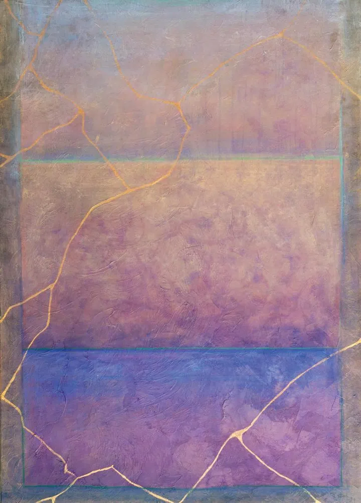
Spirit Rise.
Related article: A Fashionable Life: Inside Photographer Jayden Tan’s Cheeky And Colourful Bachelor Pad
What do you consider a success?
To me, being an artist is a success on its own. All my life, I wanted to learn how to paint, and it was always something I was striving to do growing up. And so is being relevant. I had a painting called Kintsugi Sun, and a woman from California reached out to me and said that she meditated on Kintsugi Sun every day as it helped her process a traumatic experience, and I thought, “That’s success, that’s powerful. That is exactly the message I want to send.”
What are some words of advice you would give other artists?
Of course, you have to practise, no matter what your art is. Even if it’s a day where you don’t feel creative, just bring out the notebook and draw circles. Practise and allow the right brain to have some activity. Connections is also how you find your community of artists and stay in touch with what’s going on in the art world. Attend the fairs and meet the directors of galleries and other artists. I have an art collective here in Singapore and the feedback I get and seeing what they do with their work just keeps me going.
Art direction: Sheryl Seah
Photographer: Angela Guo
Styling: Gracia Phang
Makeup: Grego using Chanel Beauty and Revlon Professional