
Fable Founders Tan Jiahui And Eugenia Chin On The Intricacies Of Typography, Cultural References And More
Meet the founders of Fable, a design studio in Singapore that brings type to life.
By Larissa Wong - published
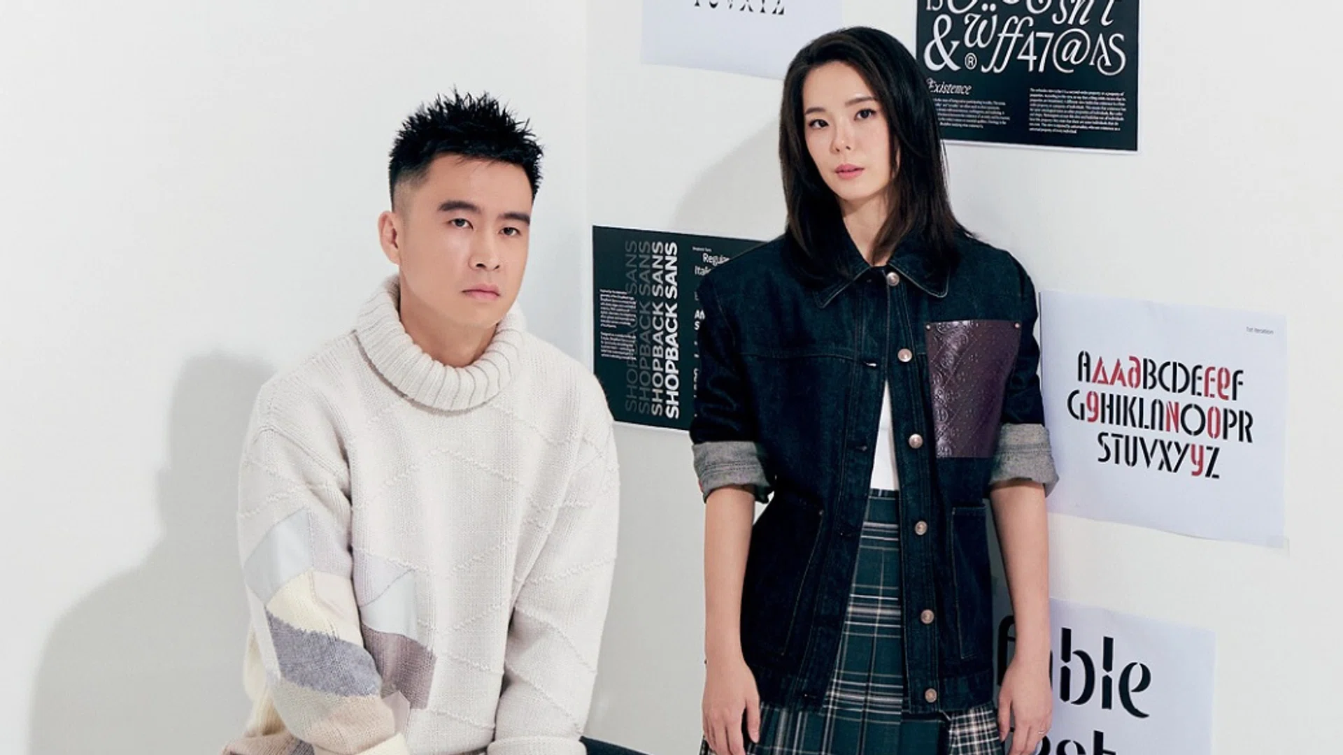
To Tan Jiahui and Eugenia Chin, typography is more than the letters on a page and a screen. As the founders of Singaporean design studio, Fable, the duo sees type as a quiet reflection of culture— one that can reveal how a city looks, feels and evolves. Their approach moves between strategy and craft, drawing from everything from Singapore’s bilingual road signs and HDB block numbers to its layered mix of old and new. For Fable, the challenge is not simply to make letters look good, but to give them a voice of their own.
In celebration of Harper’s BAZAAR Singapore’s 25th anniversary, we tapped on Fable to create a bespoke typeface that will be officially launched this November on our print and digital platforms. Below, they share with us what inspires them, their creative instincts, and their upcoming project with Harper’s BAZAAR Singapore.
Related article: GOFY’s Founders On Championing Southeast Asian Artists And The Business Of Art
What first drew you to typography and type design?
Jiahui: I have always been fascinated by how invisible type can be. Growing up, I did not have the language for it, but I noticed how a menu, a transport wayfinding element, or a warning sign could feel completely different just because of the letters. Typography was this quiet force shaping how we read the city. Typography represents society, culture, and anthropology.
What inspired you to start Fable, and what did you want the studio to stand for when you first started?
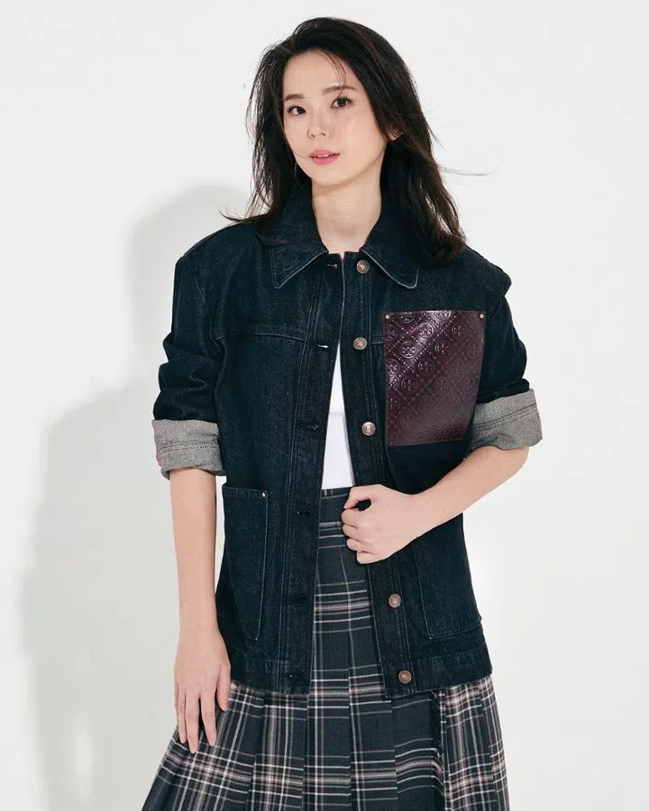
Eugenia Chin wears a Tory Burch jacket and boots with a Weekend Max Mara maxi skirt and her own top.
Eugenia: Fable started from a desire to tell more thoughtful visual stories grounded in thought. We were seeing a lot of work that was beautifully polished, but sometimes felt disconnected from the real textures of life or businesses’ needs. We wanted a studio that could move between strategy and craft, and produce works that stand the test of time.
J: It was a time with a giant shift towards beautifully documented projects (pre-AI!). While beauty is absolutely essential, I wanted the studio to stand for storytelling and still very much so. The entire history of our species is constructed around storytelling through the millennia of advancement through civilisation, language, and technology—and I believe it will always be.
Could you walk us through your creative process, from first spark to the final result?

Tan Jiahui wears an Hermès sweater and trousers.
J: The first spark is usually a mood, not a letter. We build a little world around that feeling: culture, art, history, and conversations. Only then do we start drawing letterforms that belong in that world as we move into sketching, both on paper and digitally. Early on, it is about testing parameters—pushing proportions too far, making Bézier curves too deep, then slowly pulling things back until the typeface feels inevitable, like it finally can exist.
E: Once the core characters are set, the rest of the process is refinement and systems thinking: spacing, rhythm, and how it behaves in headlines versus small captions. The final result should feel effortless, but it is really the product of a lot of tiny, obsessive decisions.
Where do your ideas usually begin?
E: For commissioned typefaces, they usually begin with a constraint: a client’s problem, a specific medium, or a cultural reference we want to honour. For the Harper’s BAZAAR project, the constraint was beautiful: it had to feel like Harper’s BAZAAR, but it also had to be unmistakably Singaporean. That tension gave us a very clear playground.
Once the constraint is defined, ideas come from asking, “What if we took this rule seriously… and then bent it a little?”
J: For our retail typefaces, I prefer to steer away from colloquial executions inspired by cultural vernacular. It is simple—I just begin sketching some letters I wish existed. Of course, from there I expand from the control characters and character groups to a bigger character set. The most fun part is working with the team on stylistic alternates where we can create glyphs nobody asked for. Hey, type design is very painful. It's important to remember to have some fun.
Related article: Creative Technologist Aditi Neti On Humanising Technology, Keeping Traditions Alive And More
Is there a particular place, object, conversation or reference that tends to spark something in you?
E: Conversations with non-designers inspire me. When someone says, “I don’t know why, but this looks expensive,” or “This feels very Singaporean,” I pay attention. They’re describing typography in emotional terms, and that’s ultimately what we’re designing for. Those phrases become little briefs in my head.
Typography is often seen as technical, but your work has a strong sense of personality. What makes a typeface feel like it has a character of its own?
J: I have some formal but not extremely deep training in type design. I feel this imposter syndrome approach gives me the breadth and also space to experiment and explore. Type, at the end of the day, should represent the creator who creates it; as well as the audience it is created for. I see the beauty in referencing certain anatomies and paying homage to the classics, while also appreciating the possibilities of the unknown and unexplored. Knowledge should act as a springboard, not an anchor.
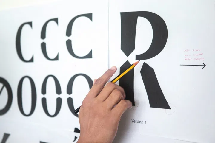
Working on the Harper’s BAZAAR Singapore typeface
With the Harper’s BAZAAR Singapore typeface, we wanted a character that was poised but not pretentiously perfect. So the skeleton is quite rational—inspired by the clarity of Singapore road signage—but we introduced subtle gestures in the curves and contrast that feel more editorial, more dressed up. It’s like seeing someone in a tailored suit wearing their favourite footwear.
E: A typeface has personality when you can imagine how it would speak if it were a person. Some fonts whisper, some lecture, some flirt. The technical work—spacing, proportions, contrast—is really just the grammar. The personality comes from how all those choices add up to a voice you can almost hear.
From architecture and signage to everyday objects, Singapore has a very distinct visual language. What are some of the things you find yourself constantly noticing or drawing inspiration from?
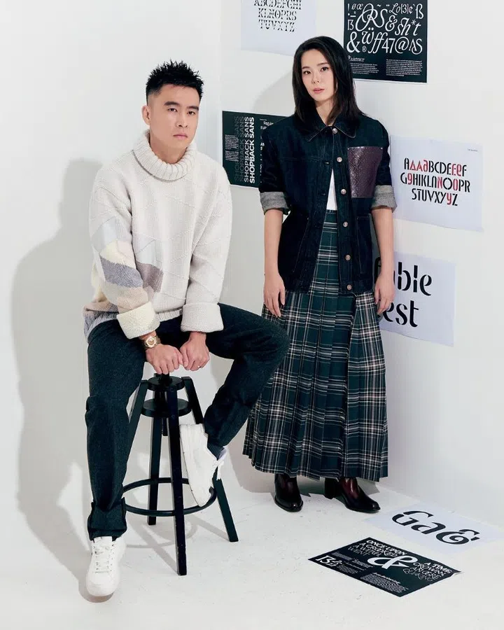
The pair and their past works.
J: I am constantly noticing the layering in Singapore—the way a sleek glass façade sits next to an old shophouse, or how a very official road sign might be surrounded by handwritten notices and makeshift banners. That visual tension between order and improvisation is very Singaporean to me. The beauty here is about noticing and appreciating the chaos amidst the intentional order.
I also love our public typography: HDB block numbers, carpark markings, the green of our road signs, the bilingual layouts. They’re not designed to be “beautiful” in the traditional sense, but they are functionally honest. When we worked on the Harper’s BAZAAR Singapore typeface, we wanted to honour that honesty while translating it into something fashion-forward.
Related article: Field Pottery On Using Clay As An Outlet To Express Creativity And Their Love For Nature
When you look at a piece of typography, what do you notice first that the average person might overlook?
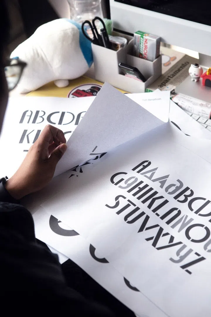
Fable’s past works.
J: I like to look at imperfect typefaces. I believe there is beauty in sharing unreleased works-in-progress, rejected specimens, and failed attempts. In this age of judgement and incessant need to show perfection, I believe these are equally beautiful if not more essential. I also notice the rhythm between the letters – the spaces more than the shapes. Most people look at the black; I am often looking at the white. How the gaps between letters breathe, how a line of text flows or stumbles. That rhythm tells you a lot about the care that went into the design.
When working on client projects, how do you strike a balance between staying true to your own creative style and adhering to a client’s vision?
E: We see our style less as a visual signature and more as a way of thinking. Our job is to understand the client’s world deeply, then bring our perspective to it. That means asking a lot of questions, challenging assumptions, and then translating all of that into typography and visuals that feel authentic to them.
JH: There are a few things we don’t compromise on—clarity, craft, and integrity of the idea. Within that, we are very open. If a client has a strong vision, we treat it as a brief, not a limitation. Often, the most interesting work happens when their instincts and our instincts collide and we find a third, unexpected direction together.
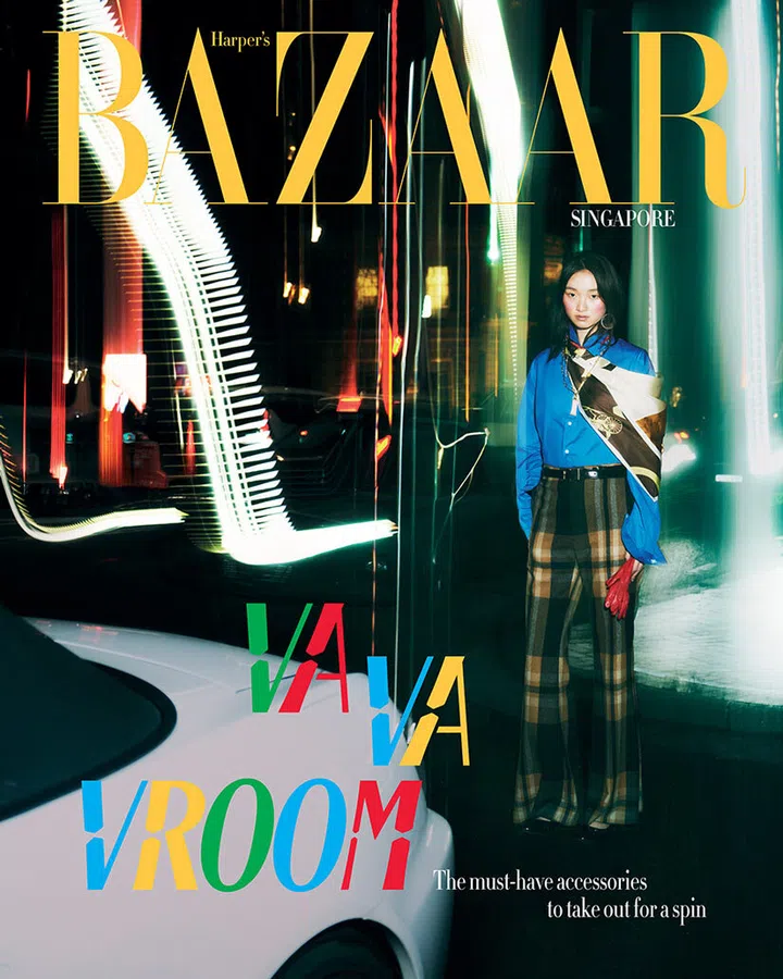
Harper’s BAZAAR Singapore’s October 2026 issue incorporating the typeface designed by Fable
Tell us about Fable’s typography project with Harper’s BAZAAR Singapore. How did you approach working with a fashion title, and what were the challenges and considerations?
JH: Working with Harper’s BAZAAR Singapore was a chance to bring two worlds together: the strict clarity of our road signage and the elegance of a fashion title. We asked ourselves, “If the fonts on our expressways suddenly appeared on a runway, what would they look like?” That question guided the entire project.
We studied the proportions and logic of Singapore road signs—their legibility, their spacing, their very matter-of-fact tone. Then we carefully introduced fashion into that system: more refined curves, subtle contrast, details that feel editorial without losing the underlying clarity. The challenge was to avoid pastiche. We didn’t want a costume version of road signs; we wanted a typeface that genuinely worked for BAZAAR’s layouts while carrying a quiet nod to the city outside.
Another consideration was versatility. The display type had to perform in different contexts digital and print. So we spent a lot of time testing it in real BAZAAR layouts with the team and making sure it could be both striking and readable. In the end, the goal was for readers to feel something familiar and local with a touch of artistry and intention.
Art Direction: Alice Chua
Photography: Isabelle Seah
Styling: Gracia Phang
Makeup: Rina Sim using YSL Beauty
Hair: Grego using Revlon Professional